When Nick Freshman started talking to me about launching a new business in the restaurant industry, I was immediately interested in helping. New entrepreneurs and developing a brand make me swoon, and, here at @ArlStrategy we love food, so, this was the PERFECT project for us.
Who are they?
Mothersauce Partners – restaurant experts and “investors on a mission to provide food and drink entrepreneurs with access to capital and business acumen – the two things that routinely hamper concept growth.” Quote by founder Nick Freshman.
What did they need help with? Developing their brand identity and assets. Mothersauce Partners turned to Arlington Strategy to assist with their logo and website.
Here’s how we did it.
Client Discovery + Market Research Phase
Step one was client discovery that included a brand survey (list five adjectives that describe your company, list your ideal “consumer”, share five brands you love, etc) and also meetings with the client. This is a critical first step in our work with new entrepreneurs. We need a solid understanding of what your company will do and what sets you apart from the competition. We also need to understand the type of image you want to portray.
After we had a firm grasp of the mission of Mothersauce Partners and the way Nick wanted his company to be portrayed, we researched the competition. Clients are often unaware of other companies operating in their space, and our analysis is critical to determining how to position our clients in the marketplace. While our research identified a few businesses that did have some overlap, MSP offers a unique model and an innovative approach to launching new restaurants. There are plenty of great ideas and chefs who want to launch new restaurants, but, with a lack of funding (250k+!), their ideas never come to fruition. Likewise, investors are always looking for new opportunities although need strategic guidance in what can be a risky business.
Logo / Brand Development
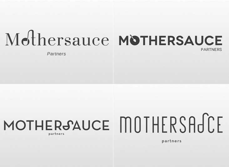
With a firm grasp on the type of brand Mothersauce Partners had in mind, we sent explicit details to designer Ashley who did her behind the curtain voodoo (we mean creative process) on their logo.
Logo [loh-goh]: graphic representation or symbol of a company name, trademark, abbreviation, etc., often uniquely designed for ready recognition
Ashley initially developed several different concepts, in different colors and fonts. Once the client selected a concept, we worked to refine the design and finished with the final logo:
Website Content Strategy and Copywriting
With our research in hand and client-approved logo, the next step was creating a website outline. We develop a content strategy to ensure that the our targeted website visitors can find the information they need in a logical and efficient manner. This includes determining the best navigation design – what information needs to be where, and how is it organized. Websites are flexible and are built to modify easily, but nailing down navigation is a critical component for launch.
Once we finalized the navigation, we began writing out important pieces of information including page headers and bullets of what would go on each page. Once Nick approved the messaging framework, we began an iterative process of writing content, with ample input from the client at every stage.
Design magic
This is the cool part. Designer Ashley incorporates the brand survey from the research phase, the logo, and the content framework to design a homepage concept. She found great images that enhanced our copy and the pages of the website fell into place. After the necessary site testing, client revisions and final touch ups, the website (and Mothersauce Partners) was officially launched in the summer of 2016.
So how are they doing?
Great. Mothersauce Partners is thriving and their first concept, Takoma Beverage Company, is already a beloved spot in the heart of Takoma Park. To learn more about TKBC or other projects Mothersauce Partners is working on, check out their website or blog.
