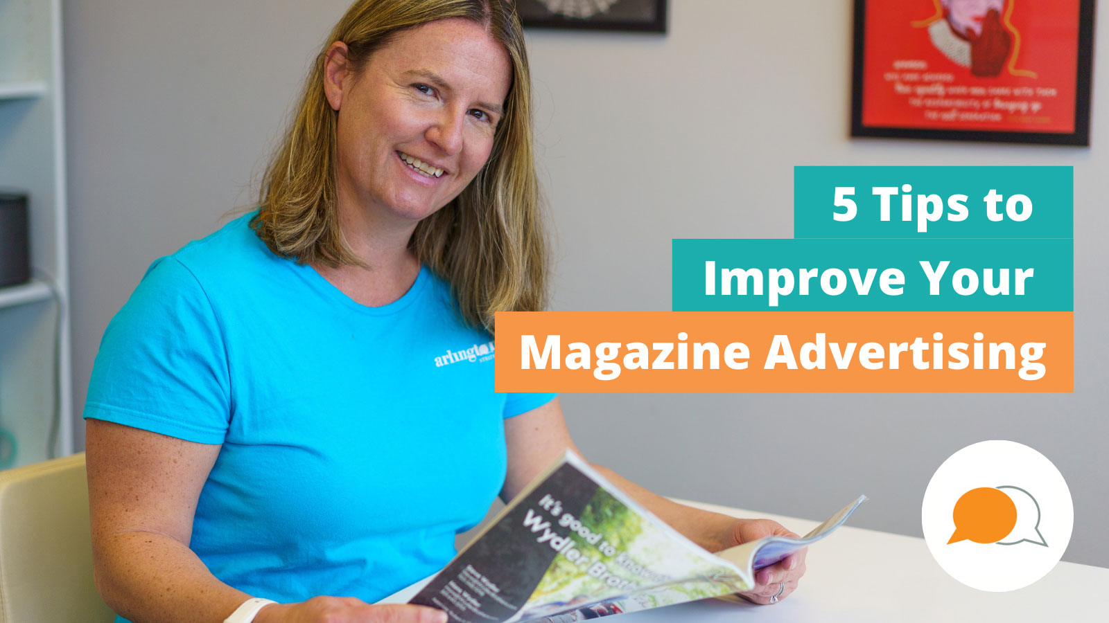
 Who doesn’t love to sit down and flip through a magazine?
Whether you are trying to set a good example for your kids by getting off screens or wanting to relax with coffee on a Saturday morning, magazines still have a place in our lives. Even in this digital age, magazines are still relevant. According to Statista, magazines outperform other printed publications and have enjoyed a relatively stable readership in recent years.
Magazine advertising is part of the overall experience of sitting down with your favorite magazine. High-quality advertisements usually complement the publication’s content, but let’s face it, sometimes those magazine ads fall flat. You know it when you see it — it’s a jarring speed bump in the pleasurable experience of diving into a magazine.
So, what makes a great magazine ad? Our team went to work for our readers and spent weekend mornings on the couch reading magazines, noting what worked and what didn’t work for our favorite magazines. We’ve compiled five tips to have your magazine advertising stand out to help you avoid expensive pitfalls when developing your next magazine ad!
Tip 1: Identify Your Magazine Advertising Goal
This seems easy enough. You want to sell more of your product or service. Isn’t that the point of taking out an ad? Take a minute before drafting an ad to write down your exact goals for the magazine ad. Even better, determine those goals before purchasing an ad, so you don’t waste money on a publication that will not meet your advertising goals. When you are done creating your ad, go back and look at your goal. It’s easy to get caught up in the details of producing an ad and end up with a magazine ad that doesn’t meet your original goal.
Tip 2: Less is More
Magazine advertising is expensive. It’s only natural that you want to convey as much about your business as possible in your magazine ad. After all, you want to get the most out of that ad space! But, the truth is, less is more in magazine advertising. Magazine readers flip through a publication. An ad that is packed with copy will get ignored in the page-turning. Make the most of your ad by choosing key messages that will resonate with readers vs. cramming everything about your business into the ad.
Tip 3: Keep it Simple
Did you fall in love with that fancy font? Sure it might look good on your external monitor, but in a ¼ page ad, the copy quickly becomes hard to read in unusual fonts. It’s best to stay on brand and use the standard fonts in your brand guide instead of trying a new font. If people can’t read your ad, they will simply flip the page and keep on moving.
Tip 4: Impactful Imagery
Reading a magazine is an experience. Magazine advertising needs to complement the content in the magazine. High-quality lifestyle magazines demand quality images in their magazine advertising. Select images that quickly and clearly convey who you are as a business. High-resolution images are an essential component of a great magazine ad. We always recommend investing in a professional photographer if you plan on creating magazine ads.
Tip 5: Reality Check
You have spent hours crafting that “perfect” magazine ad. Before you hit send, share the final draft with individuals who are not as familiar with your company. Does your message come across to them? If not, then go back to editing and re-focus on your goals.
If this all seems too much, hiring a quality graphic designer is worth your time and money since you are investing a lot in the ad. Magazine advertising also performs best when repeated in more than one edition to develop some recognition within that audience. You can save on design costs by creating all the ads in the series at once. Be sure to keep our five tips top of mind when reviewing and assessing your ad, and you’ll be on your way to an eye-catching magazine ad!

